5 Signs Your Website Might Be Costing You Customers
None of these require a full rebuild to fix — but each one is a genuine, common reason a visitor leaves without getting in touch.
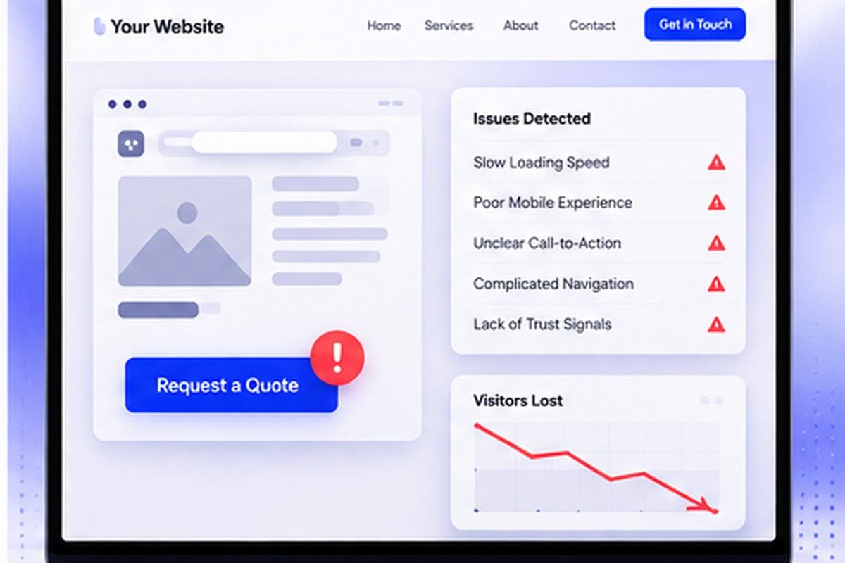
A website doesn't have to be broken to be costing you business. Usually it's a handful of small, fixable things quietly pushing a visitor toward the next search result instead of your contact form.
The most common signs a website is costing a business customers are a slow or unstable first load on mobile, a contact form asking for more than four or five fields, prices hidden behind "contact us", no verifiable company details, and navigation that hides the one action the visitor came to take.
1. The Most Important Action Isn't Obvious in Seconds
A visitor should know what to do next without scrolling or hunting for it — call, book, request a quote. If that button is buried under a long intro, or competing for attention with three other buttons of equal visual weight, you're counting on a patience most visitors don't have.
2. It's Slow on Mobile
Most people are checking your site on a phone, often with a competitor open in the next tab. Slow isn't just an inconvenience here. A real share of visitors leave before the page even finishes loading, and they don't come back to try again later.
“None of these need a full rebuild. Each one is still a real, common reason a visitor leaves without getting in touch.”
3. <a href="/pricing/">Pricing</a> Is Hidden Behind "Contact Us"
Across nearly every industry, a comparison-shopping visitor moves on faster from a site that hides all pricing than one that just gives an approximate range. Hiding the number doesn't protect you from being undercut. It just hands that visitor to whichever competitor made the information easier to find.
4. The Content Reads Generic
"We provide quality service." "Customer satisfaction is our priority." These sentences describe every business in every industry at once, which means they describe none of them, and they do zero work convincing anyone to pick you specifically. Real, specific detail — what you actually do, who you've done it for, what a project actually looks like — reads as credible for exactly the reason a generic competitor can't copy-paste it.
5. It Hasn't Been <a href="/services/maintenance-support/">Updated Since It Launched</a>
An old copyright date. A service list that's three years stale. A "recent projects" section that hasn't moved since it was built. None of that means the business is inactive. It just looks that way, and looking that way is the whole problem. A site that reflects the business as it is today builds more confidence than one frozen in whatever year it launched.
Key Takeaways
- An unclear primary call-to-action affects every visitor and tends to have the biggest impact of any single fix.
- A slow mobile site loses visitors before the page even finishes loading.
- Hiding all pricing behind "Contact Us" loses comparison-shoppers to a clearer competitor.
- Generic, copy-pasteable copy reads as less credible than real, specific detail.
Quick Answers
Usually not. Most are structural or content fixes — clearer CTAs, visible pricing, updated copy — not a reason to start over.
Depends on the business, but an unclear primary call-to-action tends to have the biggest immediate impact, since it affects every visitor regardless of what brought them there.
Try completing your own site's main action — booking, quote request — on a phone, like a stranger would. Most of these become obvious fast once you go through it yourself.
Ready to Talk About Your Own Website?
Straight answers, no pressure — tell us what you're building.
More From the Blog
What a Real Estate Website Costs — and Why the Listings Often Cannot Be Found
Quotes run from $200 to $25,000, and the line item that breaks most of them is IDX. Worse, the way IDX is usually installed hides your listing pages from Google entirely.
Read Article
What a Law Firm Website Actually Costs — and Who Ends Up Owning It
Quotes run from $1,000 to $100,000 for what sounds like the same thing. The number matters less than a question most firms never ask until they try to leave.
Read Article
A Year of the European Accessibility Act: What Actually Happened
Enforcement began in June 2025. A year later the picture is genuinely mixed — real court action, real investigations, and, depending on which source you trust, possibly not a single fine.
Read Article